I explain UX with shampoo bottles, so let me explain this one with a shampoo bottle.
In the 1970s, someone at a shampoo company added a word to the label. "Lather, rinse" became "lather, rinse, repeat". Nothing about the hair changed. Tens of millions of people, assuming the label was medical advice, started using twice as much shampoo. Entire quarterly dividends paid out by one word, typeset quietly, hiding inside an interface the user trusted as a utility.
That is the template. A tool the user assumed was neutral, silently rewritten to serve someone else. The first one you will see today is on your nightstand, the moment your alarm goes off.
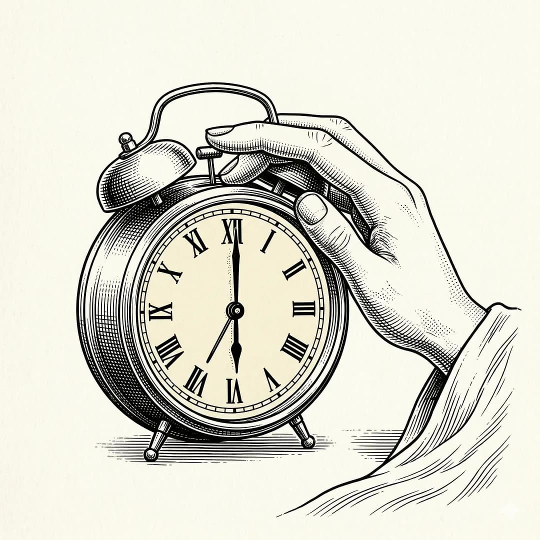
Six-thirty
The night before, you are your own manager. You have plans. You set the alarm for 6:30. You put the phone on the nightstand with the confidence of a monarch signing a treaty.
Six-thirty arrives. Your brain, currently operating at roughly the capacity of a damp sponge, reaches for the device. And the device, designed at great expense by some of the world's best engineers, opens with a question.
Are you sure?
That is the snooze button. The only control in consumer electronics whose entire purpose is to let you bail on a promise you made to yourself twelve hours ago. It is the shampoo "repeat", printed on your discipline.
The original contract
"Alarm" comes from the Italian all'arme, to arms. A battlefield signal. The Italians were not imagining a polite cough you could wave away. They were imagining the enemy at the gate.
Setting one is a commitment device. Tonight's you, sober and willed, ties tomorrow-morning's you to the mast, because you know perfectly well that tomorrow-morning's you will try to jump overboard. You pay a small dignity tax so future-you doesn't have to be a hero.
Then, six hours later, the machine asks future-you to vote on it. Future-you is thirty-two percent conscious, running on one cylinder, and has exactly one opinion, which is horizontal. Of course future-you votes snooze. Future-you would also sign a car lease right now, if offered.
This is not a dialog. It is a device asking a drunk person to initial a form.
Who decided that the correct response to an alarm was to offer the user, at their most vulnerable cognitive moment of the entire day, a loophole?
The gear that ate a century
Nobody decided it. The nine-minute interval on every phone you have ever owned is the gear ratio of a 1956 General Electric Telechron alarm clock. Ten minutes would have needed a different tooth count. Nine fit the gears they already had. So nine minutes became the default snooze interval of the industrial world, for the reason most defaults exist: a factory was lazy on a Tuesday in 1956.
Apple inherited it. Android inherited it. Every Fitbit, every Garmin, every hotel clock radio, every meditation app that claims to wake you gently speaks the dialect of a dead American clock company trying to save a nickel on brass.
And the nap does not help. It pulls you out of early-stage sleep and leaves you groggier than if you had simply stood up the first time. The medical literature calls this sleep inertia. You could also call it the hangover of the person you tried to be this morning.
So the device wakes you correctly, offers you a feature that makes waking worse, implemented with an interval picked for reasons that had nothing to do with you, and that feature is the one-tap default. Three betrayals, stacked, shipped, unquestioned.
Good UX solves a problem for the human in front of it. Bad UX solves a problem for the business behind it. Snooze solves a problem for 1956.
Defaults are where morality lives
Every honest designer I know says the same uncomfortable thing at a dinner party. Defaults are where morality lives in a product. Not the features, not the onboarding, not the marketing site. The quiet, already-there state of every toggle and checkbox. That is what ninety-five percent of users will ever experience. The default is the product.
Look at the physical gesture. Snooze is an oversized button under your thumb. Dismiss is smaller, sometimes hidden behind a slide that requires two whole seconds of motor coordination you do not possess. The easier action, the thumb-shaped action, is the one that breaks the contract.
Imagine a savings app whose default on every screen was "withdraw everything". Imagine a calendar whose default response to a reminder was "cancel". You would call those hostile interfaces. On the alarm, we call it the wake-up experience.
The civil war
Kahneman's deciding-self and experiencing-self do not share a bank account, do not share incentives, and absolutely do not share a bedtime. Every commitment device ever invented, Ulysses and the mast, the cut-up credit card, the 401(k) before payday, is designed to let the first constrain the second.
Snooze inverts this. The deciding-self, the only adult in the relationship, hands the keys to the device. The device, six hours later, hands them back to the experiencing-self, who is eight years old and wants pancakes. We call this a feature.
Good UX respects the author of the request. Snooze respects the heckler.
Thirty years of waking up is roughly eleven thousand alarms. One snooze each, conservatively, is ninety thousand minutes. Two months of your life, re-entering consciousness poorly, on an interval designed by a gearbox. Training, every morning, the reflex that your promises to yourself are renegotiable the second they get heavy. Which is precisely when commitments exist.
Once you see it
Start paying attention. The pattern was never really about alarms.
The autoplay that queued three videos before you decided to stay. The tip slider opening at twenty percent. The cookie banner whose "accept all" is a color and whose "decline" is a paragraph. The newsletter checkbox pre-ticked while you typed your email. The Send key that is also the Enter key, so every half-finished sentence became a message you sent.
Each of them is a small snooze. A word slipped onto the back of a shampoo bottle.
What habit you think of as yours was actually just the shape of a default nobody asked you about?
What opinion of yours was formed because the alternative was one more click?
How much of your attention today was spent by someone else using the fact that you were tired?
The short version
The snooze button is a 1956 gear defect that got promoted to a lifestyle. It defeats the affordance of the alarm. It negotiates on your behalf with the only version of you that should never be allowed to negotiate.
Good UX is not the absence of snooze. Good UX is admitting that defaults are moral, that every design choice takes a side in the fight between who you want to be and who you are right now, and picking the right side on purpose.
A well-designed wake-up tool would obey the person who set the alarm, not the person trying to cancel it.
The button is not the problem. The default is. And it is not only on your nightstand.